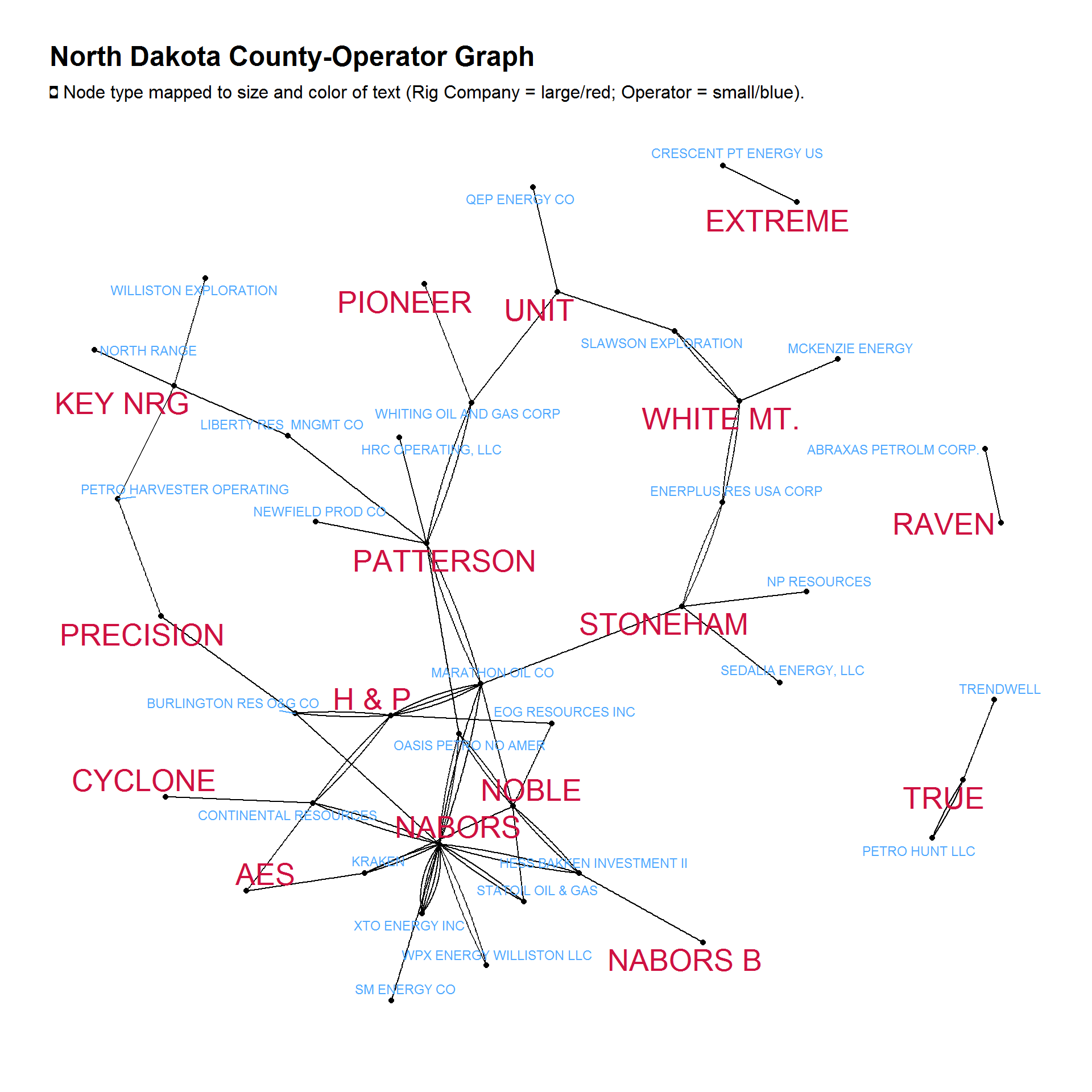
The above network graph was produced using ggraph (grammar of graphs), which recently hit CRAN. The graph shows the relationships between rig companies (large red font) and operating companies (small blue font) in North Dakota. The data are from October 2016 to present.
Each line between rig company and operator represents an individual rig. As you can see, some operators employ more than one unique rig from the same company.
In some rig companies, such a True, Raven, and Extreme, are employed by companies that do not employ any other rig company.
More graphs
Here are a few more graphs I’ve been able to create in the past week. These are really just rough drafts and could, honestly, use some touch-ups (better coloring scales, more descriptive legends, etc).
Etc…
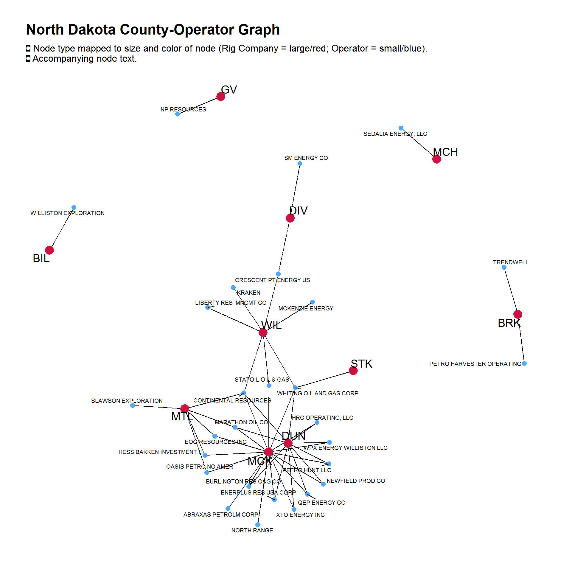
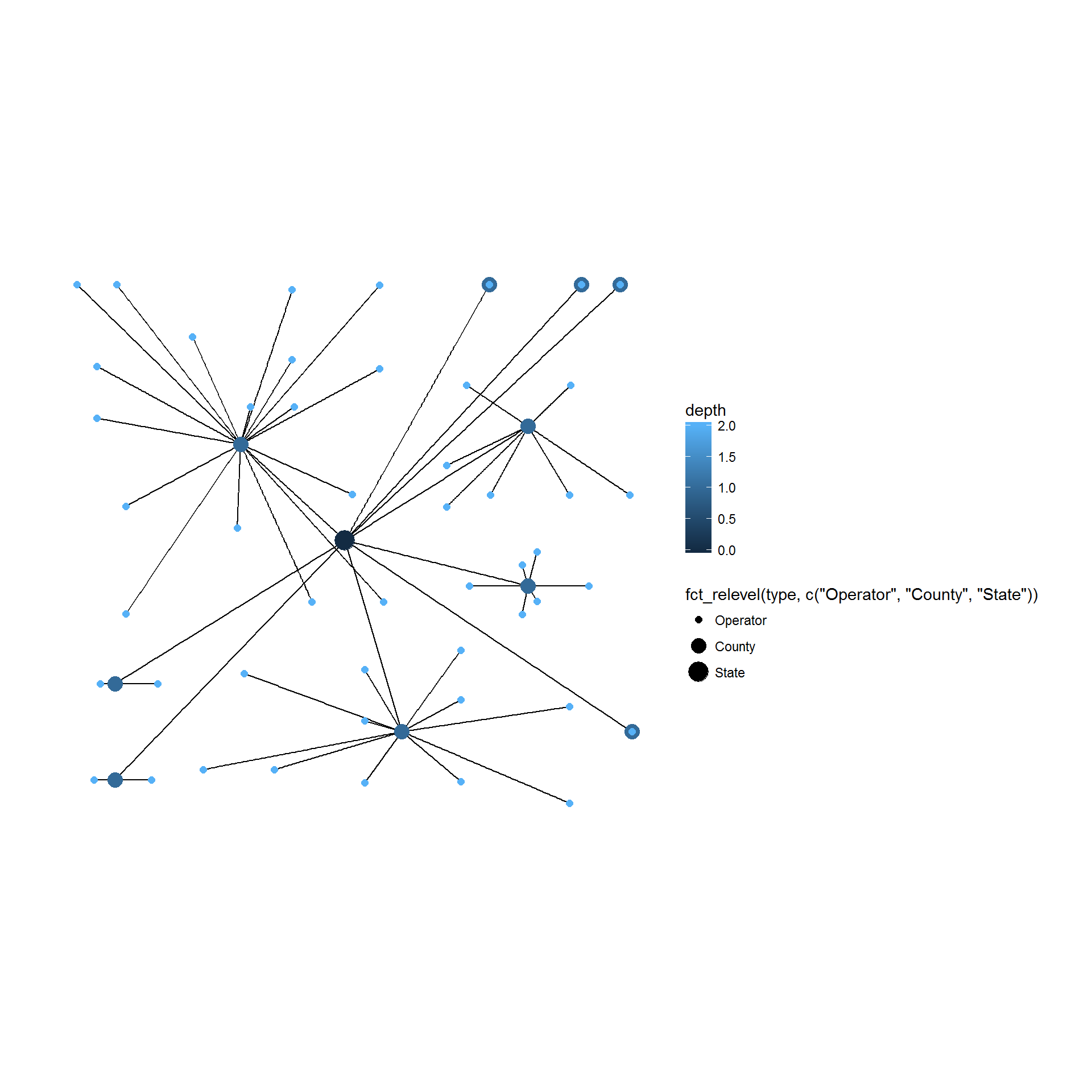
The graph below is similar to the graph above, except it shows the relationship between counties and operators.
I’ve also substituted colored text for colored nodes and added a size mapping for the nodes.
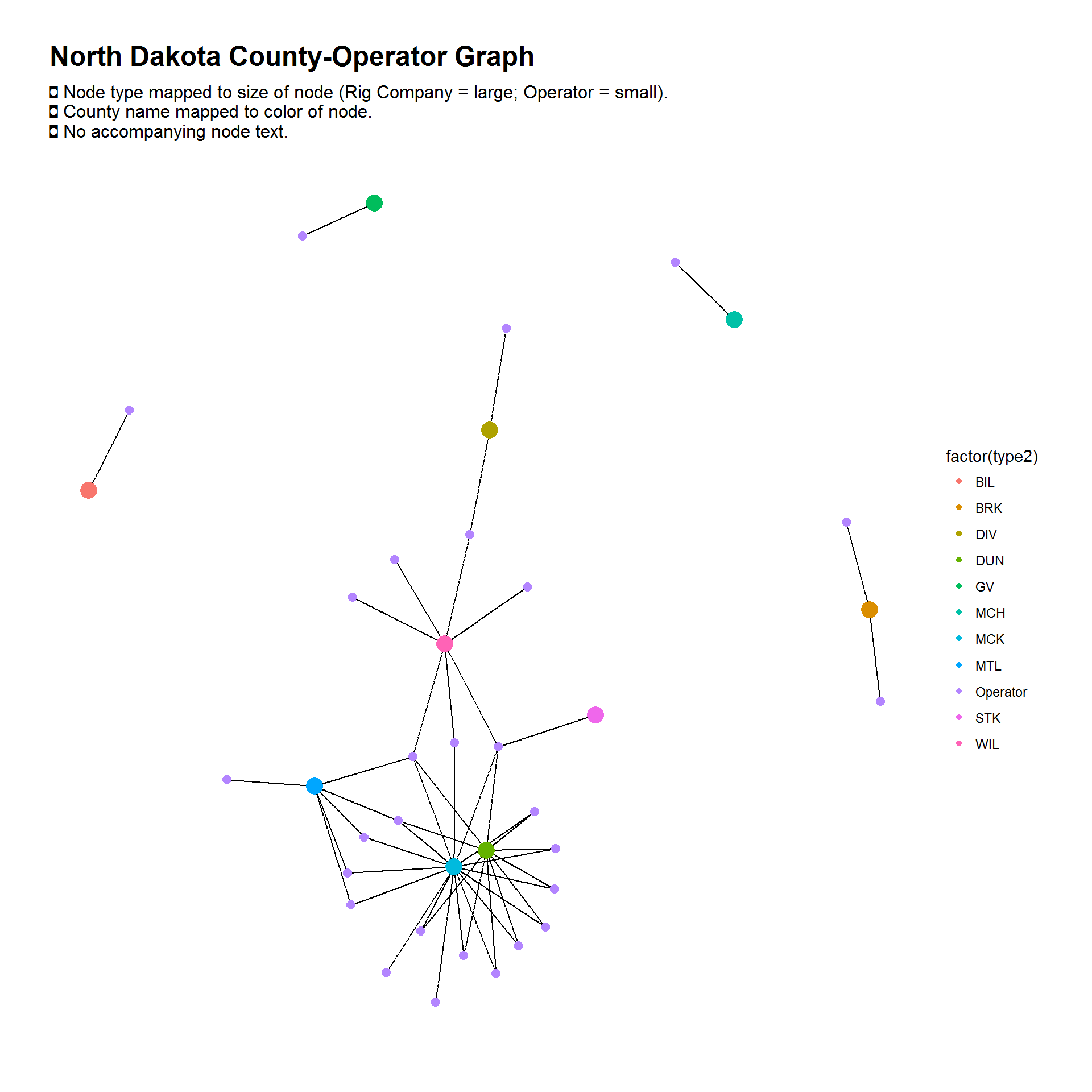
Here, I’ve added a different coloring scheme for the nodes: each county gets its own color and the operators share the same color (with no accompanying text).
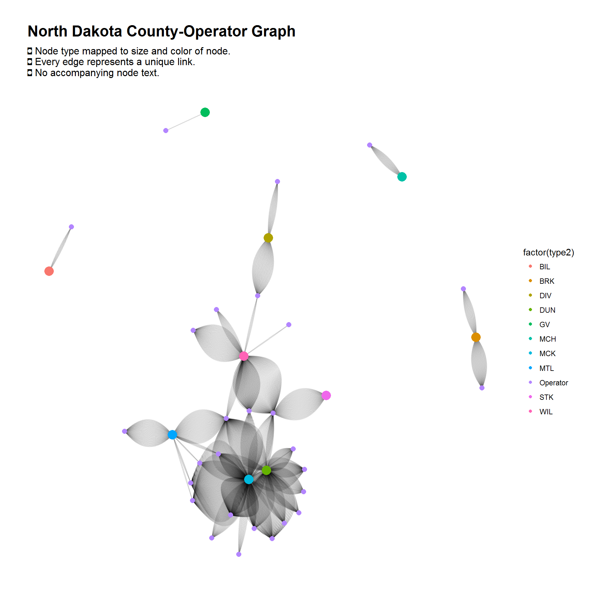
This next graph shows the same relationship as the above graph, except each link represents each well within a county for each operator.
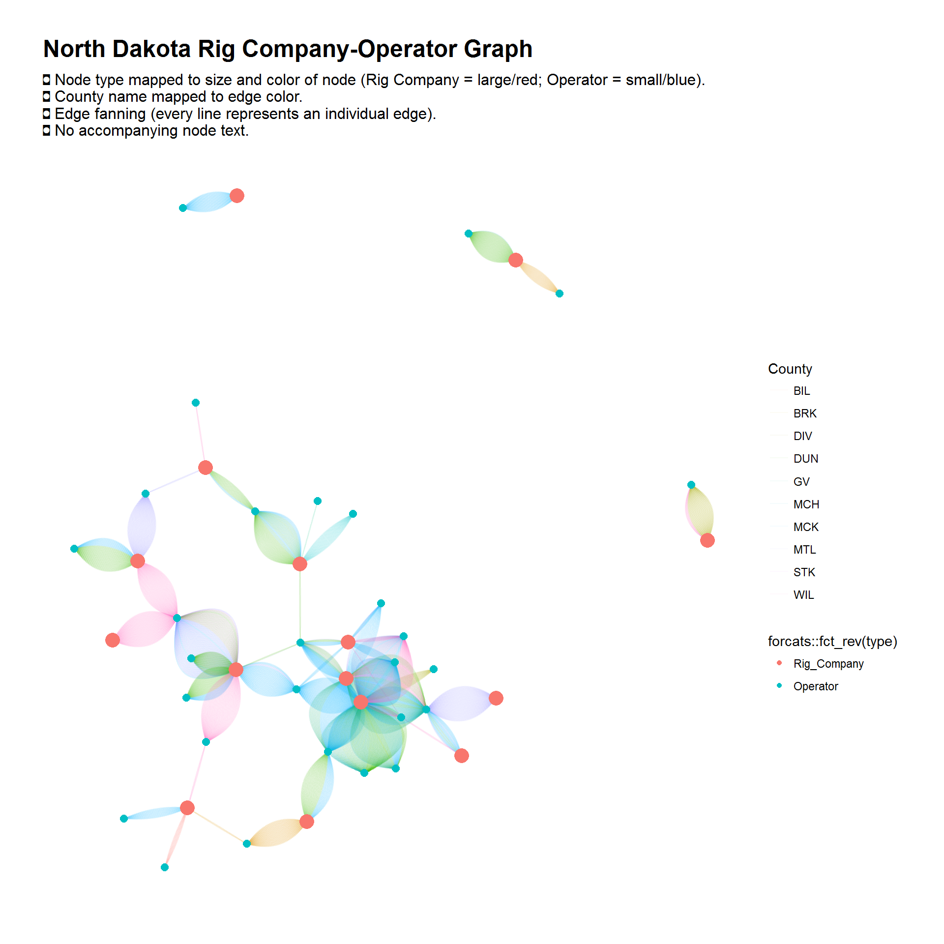
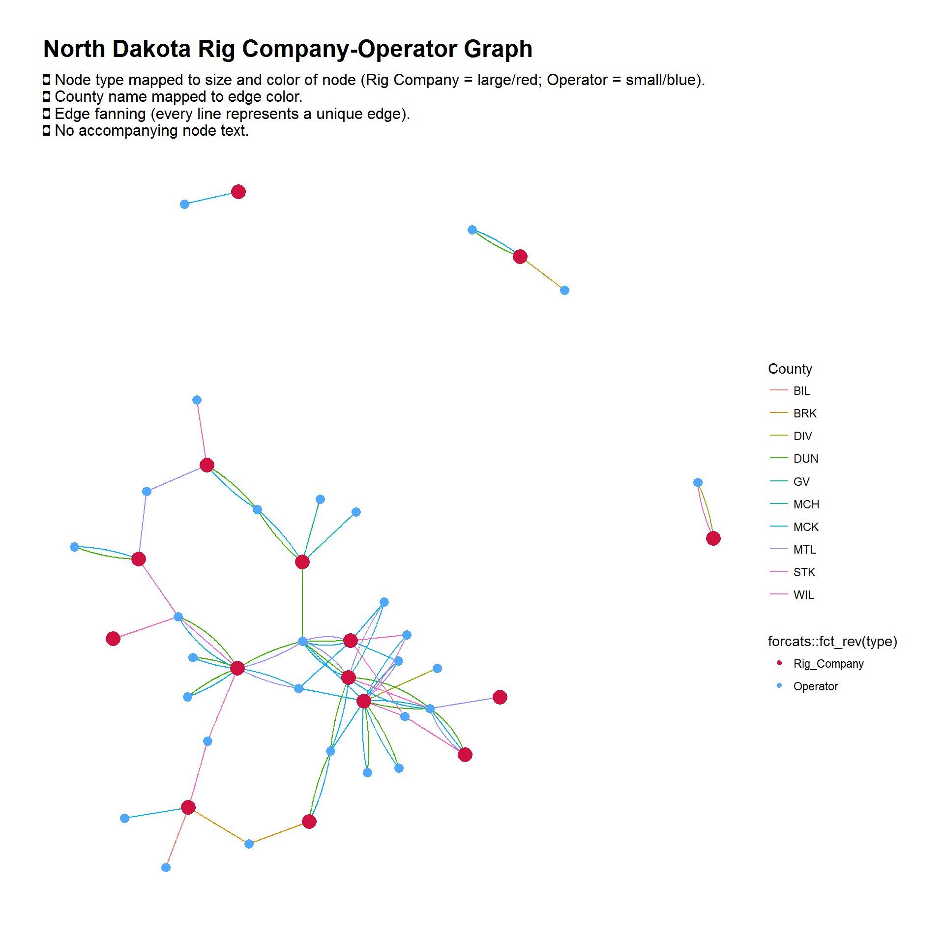
Going back to the previous graphs that mapped the rig company to operator relationship, I can apply the same kind of fanning technique as above (where each line represents an individual well for each rig company-operator). I’ve also mapped the counties to the edge (line) color.
However, you can also create a graph that shows the unique relationships on a per county basis (for the above graph).
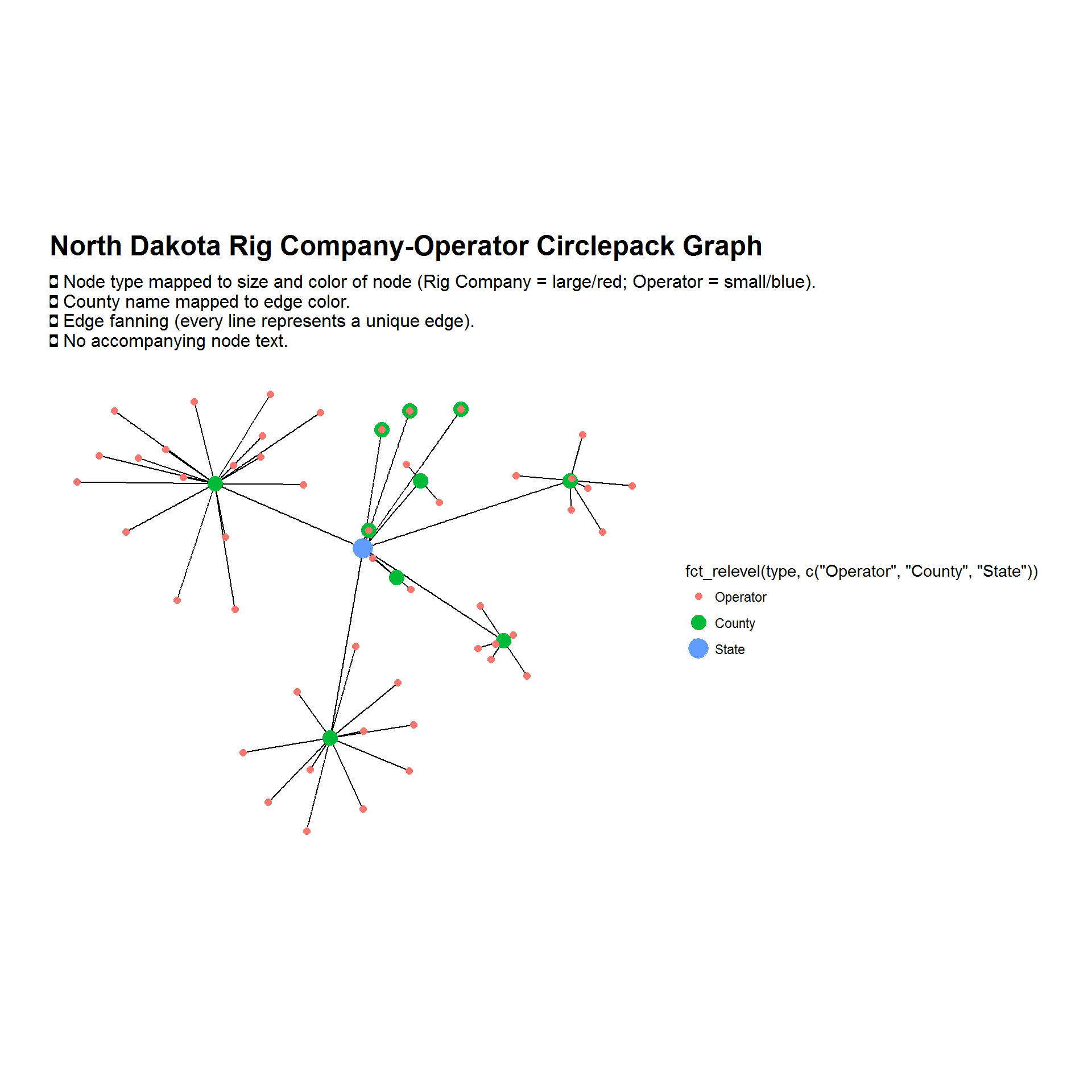
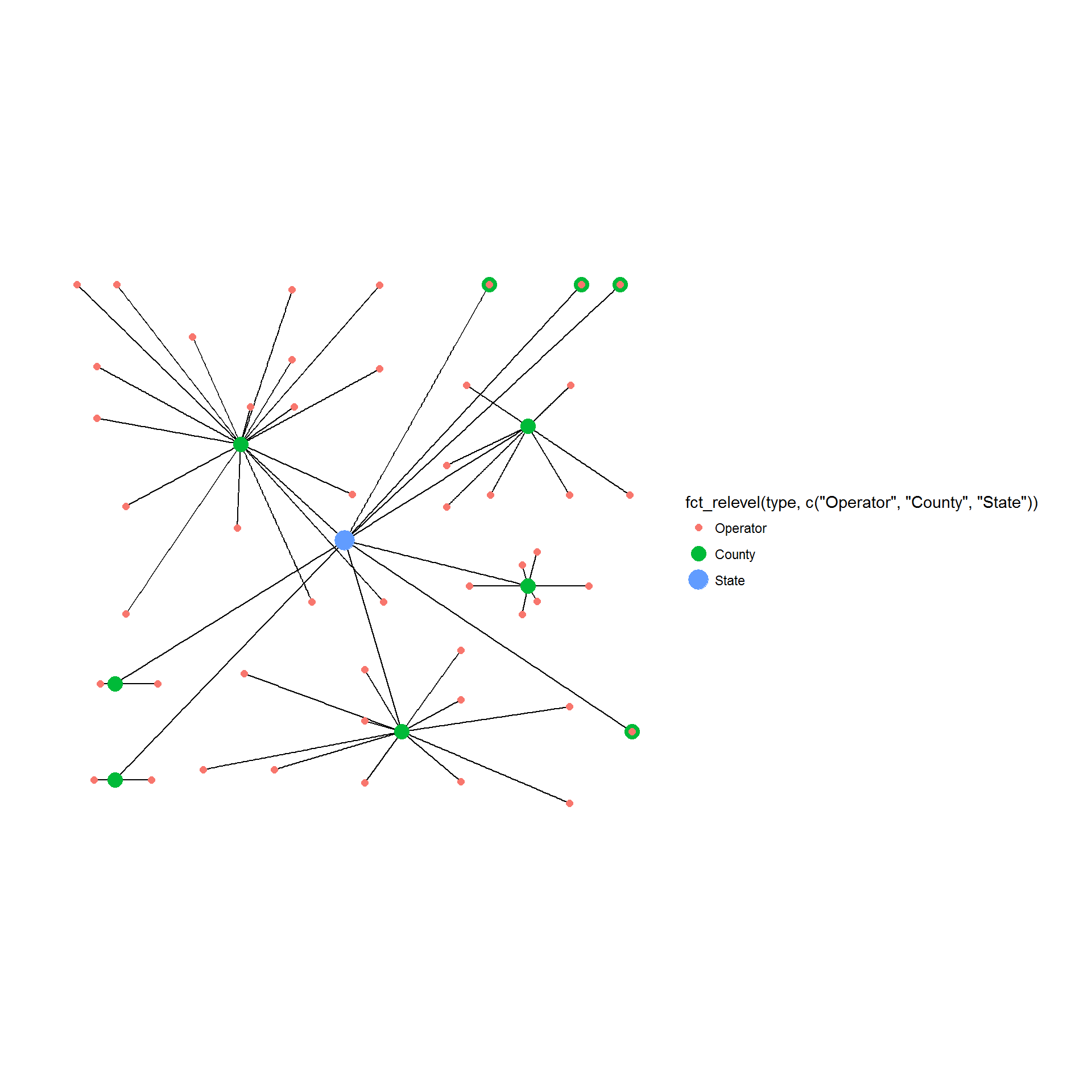
In all the above graphs, the rig company and operator nodes were never duplicated: there was always one rig company node and one operator node.
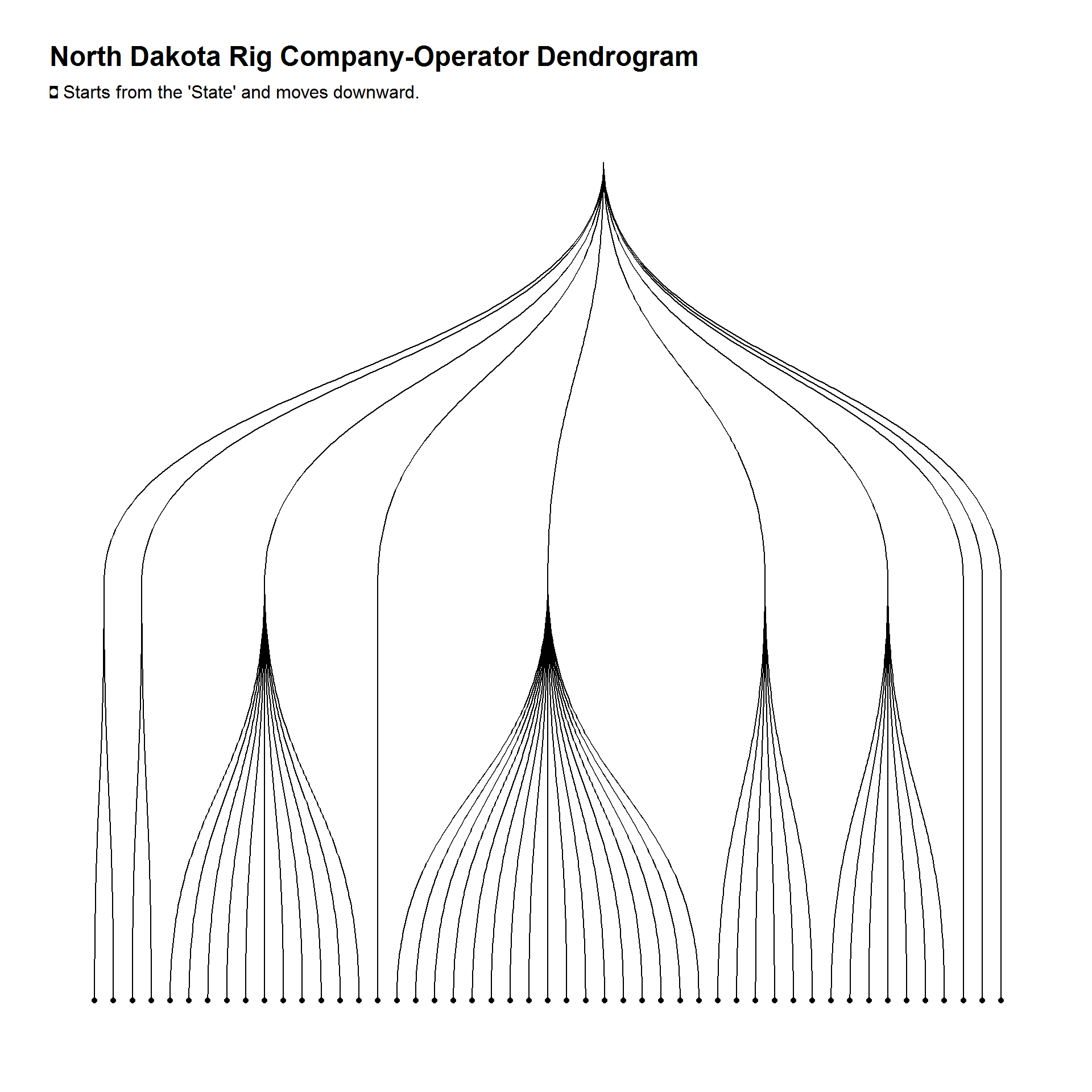
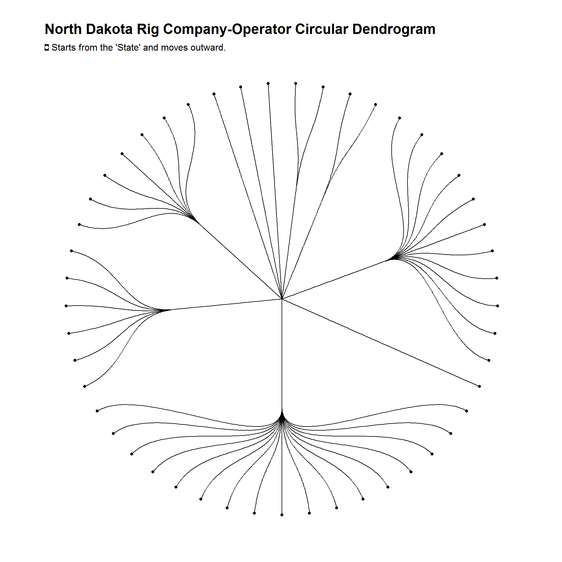
Using a tree layout, you can display a top-down hierarchy between various data points.
The graphs below have duplicated operator nodes. The county nodes however are not duplicated (so there is only one node for each county).
Dendrogram versions of the above three graphs.
There’s more
I have only been using the ggraph package (and creating network graphs in general) for the past couple weeks, but there is certainly more to it than what is displayed above. There is certainly more to network graphs than just plotting entity relationships.
In addition to ggraph’s functionality, the igraph package, one of ggraph’s dependencies, offers functionality to create layouts and add attributes to graphs (such as degree, neighborhood size, etc).
There are, also, many other graphing packages, such as: networkD3 (for creating D3.js network graphs), qgraph (weighted graphical models), and DiagrammeR (graph and network visualization).