Last month, a Junk Charts post critical of the New York Times article, Good Schools, Affordable Homes: Finding Suburban Sweet Spots, provided a few recommendations and criticisms for improving the data visuals within the article:
- Add a legend to explain the differences in the size of the dots (population?)
- Explain the horizontal scale (x-axis = grade above or below national or state average?)
- Aggregate the data (by metro area and commute time)
I decided to take the NYT data and plot it, while taking into account the considerations above, as best I can.
Imitating the Original Work
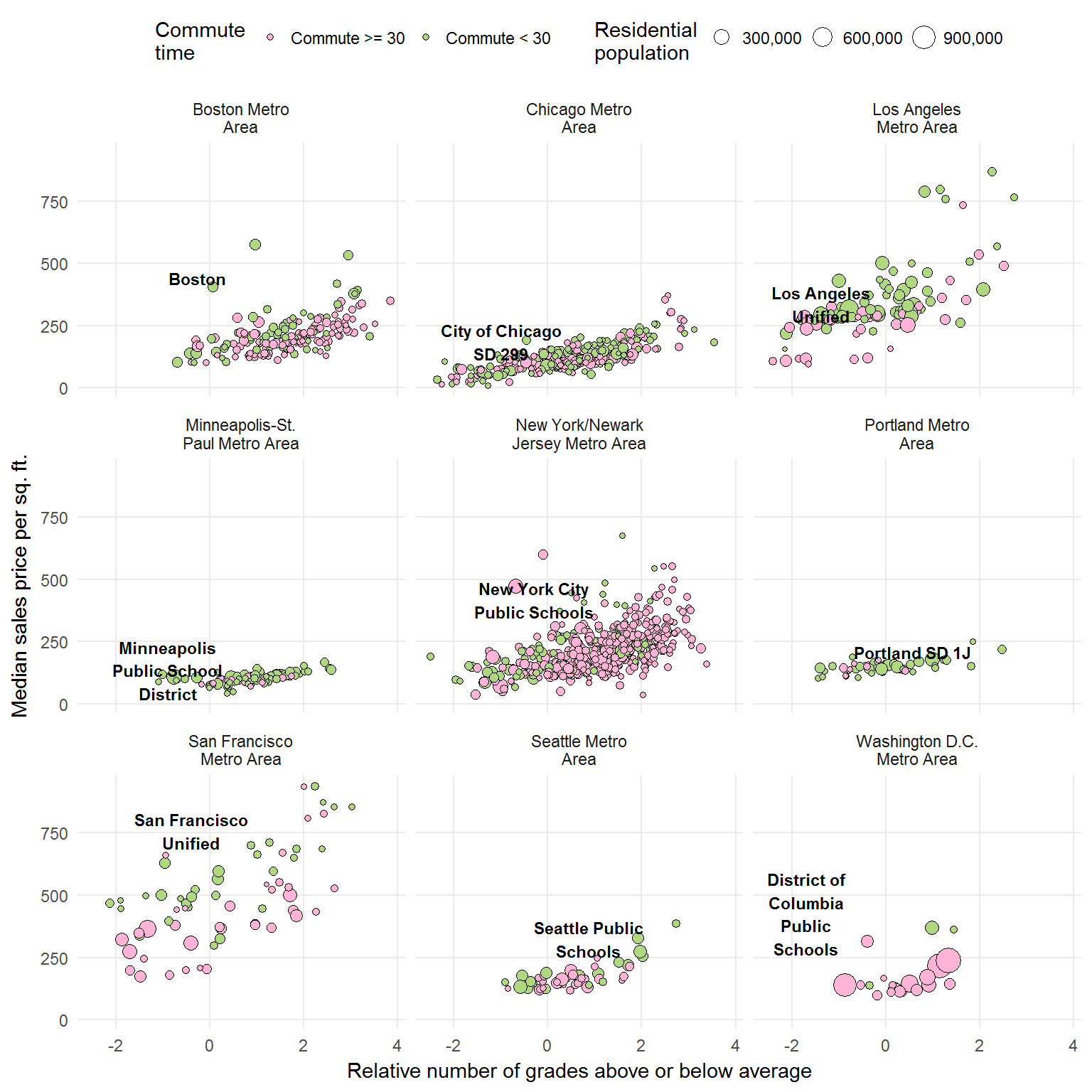
As you can see, the NYT dataset includes metro areas other than those mentioned in the article: Los Angeles, Seattle, Portland, and Washington D.C. I did my best to find a “central city” school district and plot that data as well.
Re-imagined
I want to show you how the graph above would appear if it were faceted by whether the commute time were < 30 minutes or >= 30 minutes.
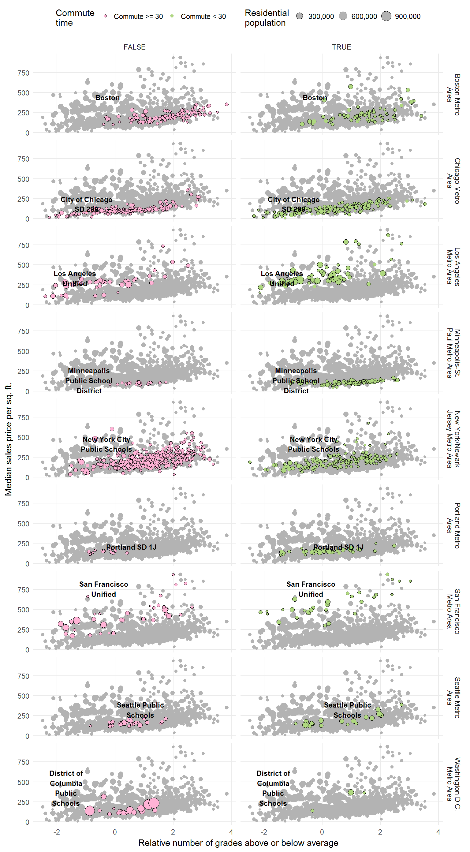
As you can see, I decided to plot all the data points in the background (good idea if this is a national grading scale).
However, this does not reveal as much as I had anticipated.
Before aggregating the data, I am going to run a very simple linear model (price ~ grade).
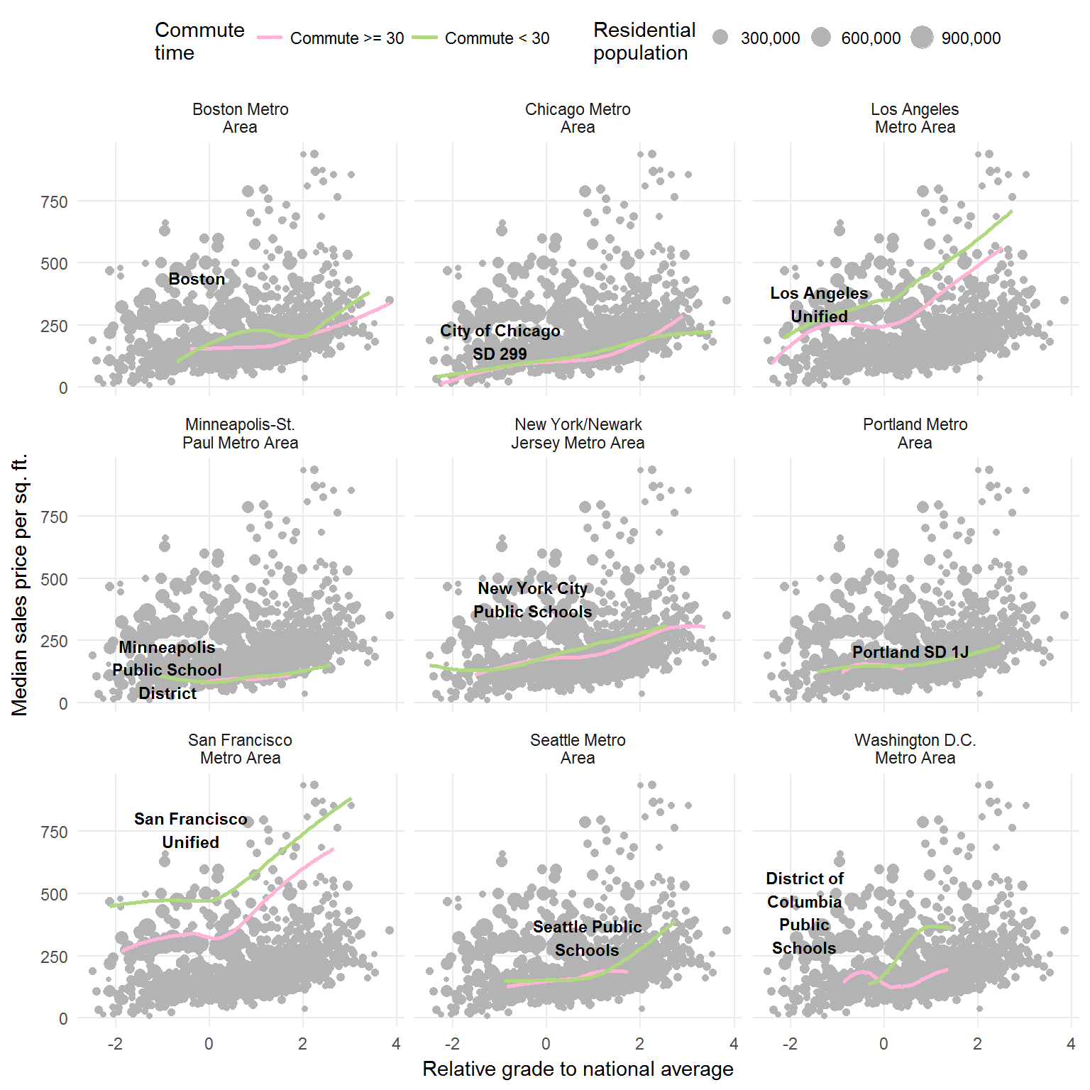
That still doesn’t quite show the relationship between commute time and relative grade. Though the relationship between commute time and home price become apparent in some cities (i.e. San Francisco).
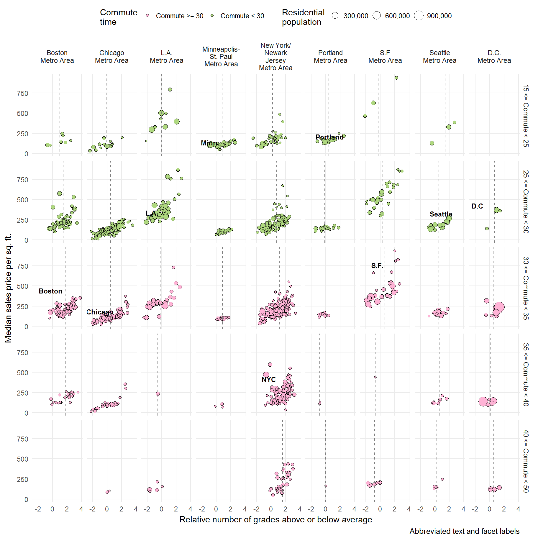
I went back to the point plot and added an extra facet: commute time ranges.
Aggregated
To aggregate each district’s data:
- I grouped by:
- Metro area
- Whether the commute was less than 30 minutes or not
- Multiplied each district’s data by it’s residential population and then divide by the region’s total residential population
- Summed each grouping
It looked something like this:
data %>%
  group_by(cbsa_title, `Commute Time`) %>%
  summarize(Population = sum(total_population),
            grade_mean = sum((gsmean_pool * total_population) / Population),
            sale_price_mean = sum((median_sale_price_per_sqft * total_population) / Population))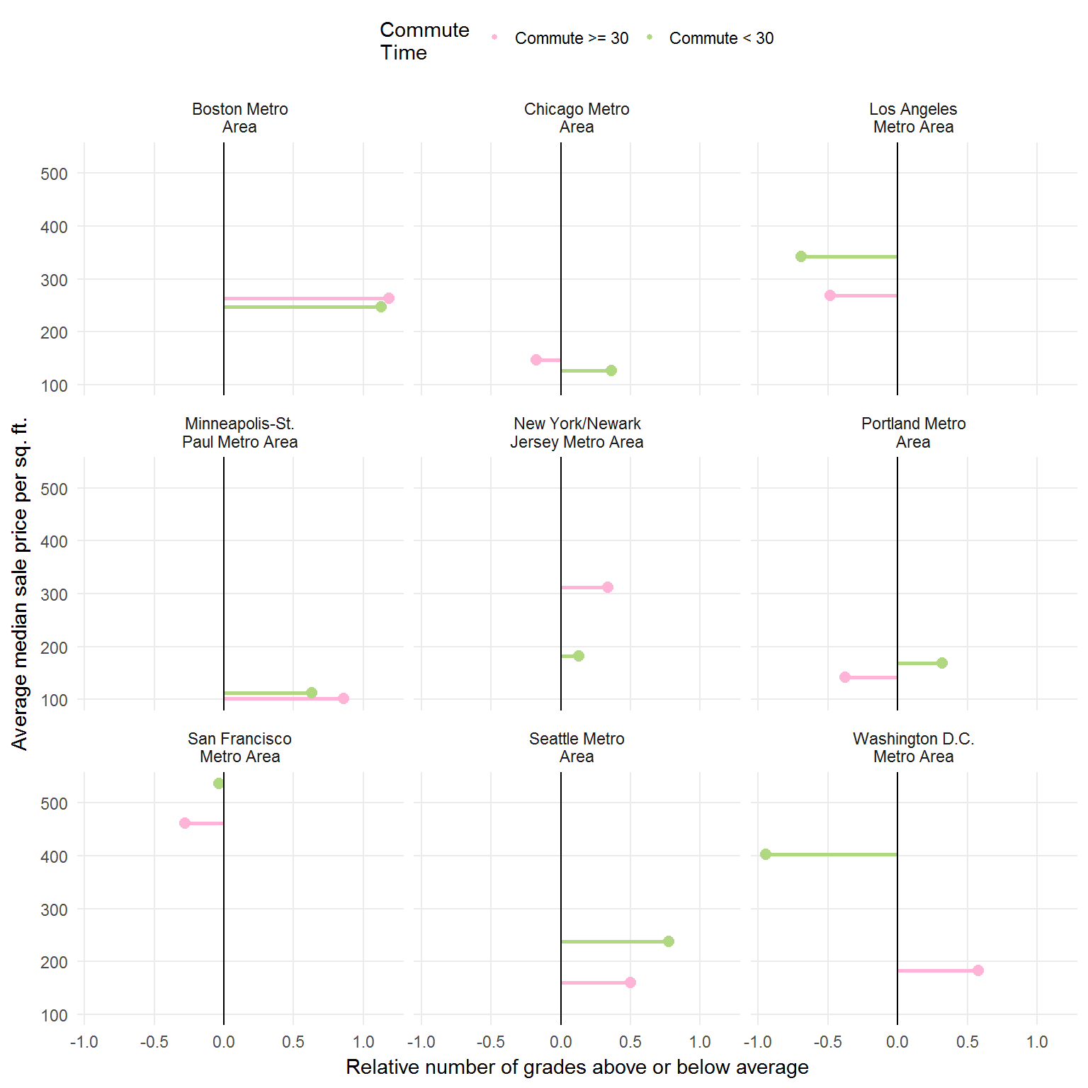
Conclusion
I had to make a number of assumptions (or ignore certain things) to make the plots above.
- The size of the dots appears proportional to the population variable in the data set, and so I mapped the
total_populationvariable to the dot size. - The horizontal axis is some kind of relative grading scale. Sadly, the variable name did not help clarify whether it applied to the entire nation, state, or metro area.
Despite my limitations, the above graphs now show the scale for dot size, state some information about the x-axis values, and, as a bonus, show all the data points in the background (gray) - which I believe would be a great idea if the grading scale were a national scale.